Corporate Brand
Let us present our brandmark, in which we put our thoughts
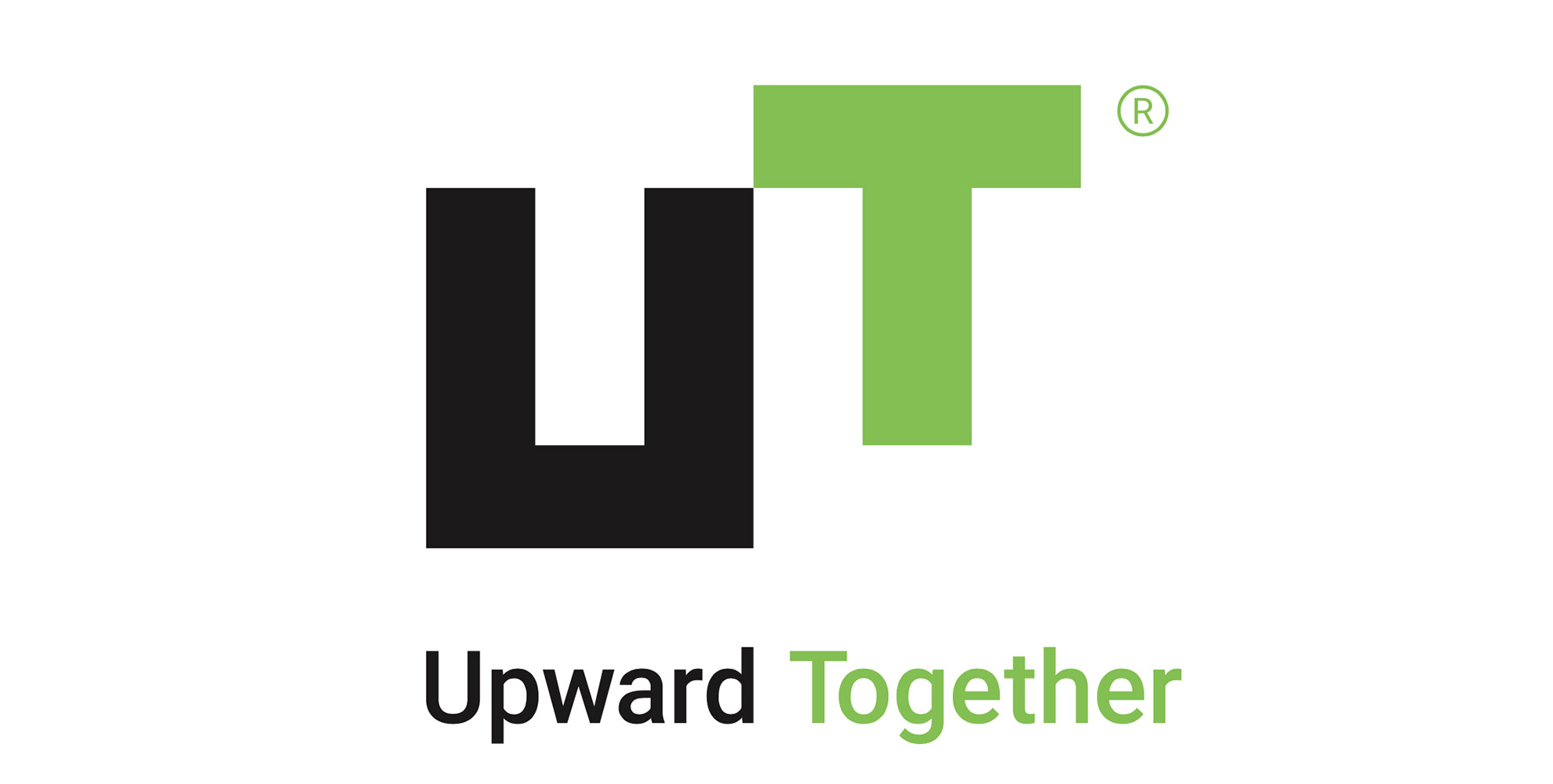
Brandmark
In July 2015 when we celebrated our 20th anniversary, we changed our corporate name from UT Holdings to UT Group Co., Ltd. Then on October 1, we changed the brandmark and established a tagline that symbolizes the image of an outstanding workforce, teamwork, and growth.

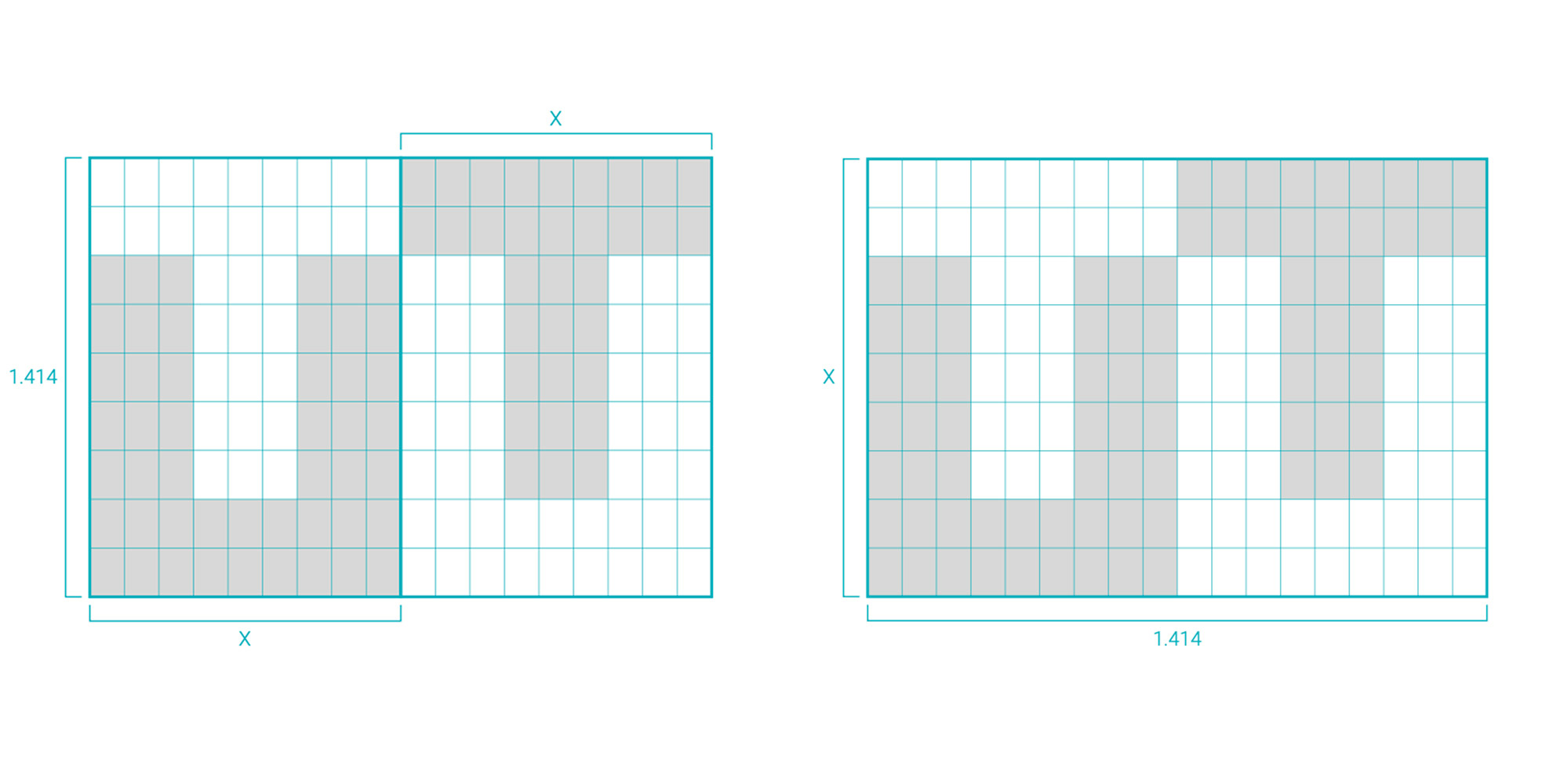
Proportion
UT Group’s brandmark was specified by using the silver ratio of mathematics (1:√2 ≒ 1: 1.414).
The silver ratio has been applied to architectural design such as that of the famous Horyuji temple in Nara and to various tools in Japan since ancient times, and can be said to match the Japanese aesthetic feeling or standard of monozukuri (manufacturing with passion). The silver ratio is also used to determine standard paper sizes.
The brandmark, which has an aesthetic rational proportion, symbolizes our attitude of aiming for the growth of our individual employees, while its shape, which tightly joins U and T, implies teamwork, one of UT Group’s strengths. The higher positioning of T relative to U stands for the growth of our people and businesses.
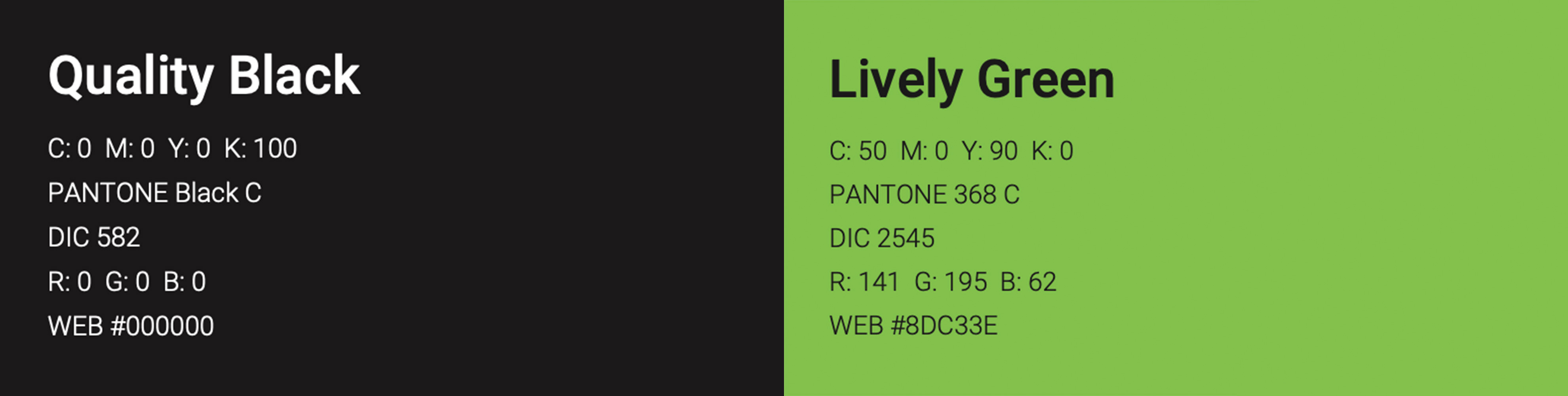
Brand colors
Brand colors are black and green.
Black absorbs all colors.
The Quality Black represents UT Group’s accumulated technology and know-how, quality services, and fair and honest words and actions. The Lively Green is suggestive of vigorous young leaves.
It also suggests flexible thinking, vigorous workstyles, and growing career advancement.
Tagline
The tagline describes UT Group’s social mission to cooperate and grow together with our clients.
While also functioning as a guidepost for the actions of our people, the tagline shows the attitude of overcoming the limits of each person’s ability and undertaking challenges as a team to develop one’s skills and capabilities.